top of page
Vive
Vive UX Design System Documentation
Role: Documentation for Vive Interactions and Patents
Responsibility: Research, Concept Sketches, Visual presentations, Illustration
Process: Research, Sketch, Iterate Solutions, Review, Illustrate concepts
Solution/Result:Official Vive UX documentation and Patents


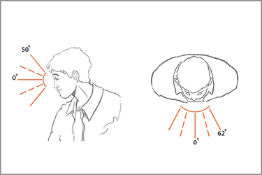
The Vive experience system consisted of over 100 illustrations that documented the interactions with the Vive controllers and how they affected what the user saw in the HMD.
There were additional over 50 storybooks that documented XR experiences with the HMD and video passthrough. These storyboards were used for patent filing.


New layout and icon illustration for Recorded TV


Previous Media Center visuals for recorded TV


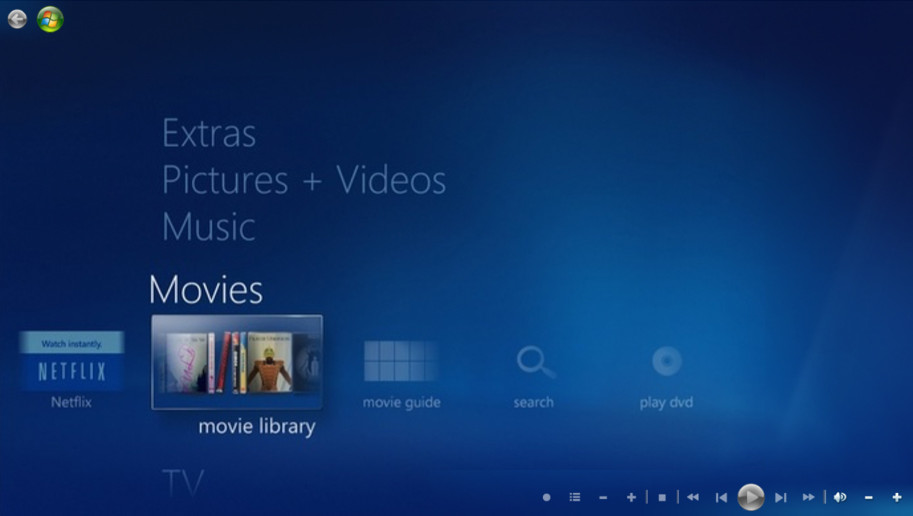
For the movie library, I chose to represent movies as DVD images with both spine and front box facing images. This software came out about 4-5 years before streaming services would become prominent.

The picture gallery icon would be the users own photos from their camera roll. Like each of the galleries I focused on making each "library" unique to the content it represented. For the picture gallery, I used not inly the teams photos, but introduced framing and several orientations associated with phots, such as landscape, portrait and panoramas. This helped give the gallery a unique flair and a visual clue toward it represented a photo gallery as opposed to movies or TV.

In all there were over 350 icons and assets created for media center, included both focus states, accessibility sets, and other assets such and common controls and preference settings.
Additionally, I also needed to create the visuals. motion design and UX for the Media center widget, which appeared on the Windows 7 desktop.
bottom of page