McAffe CXD
3D interface UX for Desktop, Mobile, Other
Role: UI Design Lead, 3D Artist
Process: Collaborate with team via Figma sessions, Concept Sketch in Figma, Zbrush, Adobe Dimensions.
Customers: McAffe Desktop and Mobile visualization
Solution/Result: Project in progress
.png)
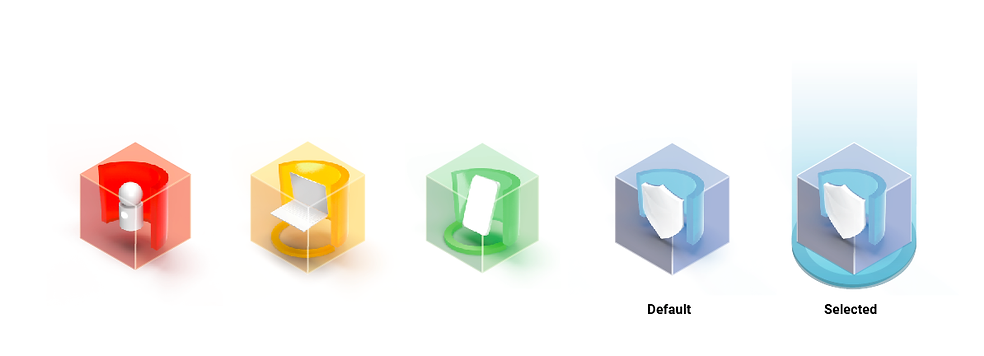
This project started with explorations using 3D iconography, rendered in real time for McAfee apps on desktop and mobile, It has now evolved into creating a 3D environment to replace flat 2D Dashboard UX
.png)
Icon Visualization concepts. Visualization for simple 3D iconography. Icons can be tapped and rotate in place.

.png)
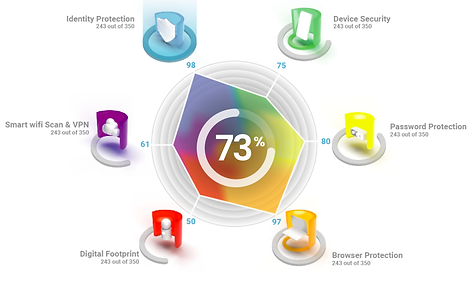
Visualization for user score with heat map showing how each sections "weight" affects the overall score. The grid for the histogram distribution chart could be tilted and rotated by the user. The user can also select each section to see how much impact it has on their overall score. From here I started exploring creating more immersive environments for the user, instead of just recreating data visualizations in 3D.

3D Dashboards and User Spaces
I started exploring the concept of simplified user "spaces".
I started with a room, as this would be the core location a user would be in to use our products. The design is simplified to be more representative of a space
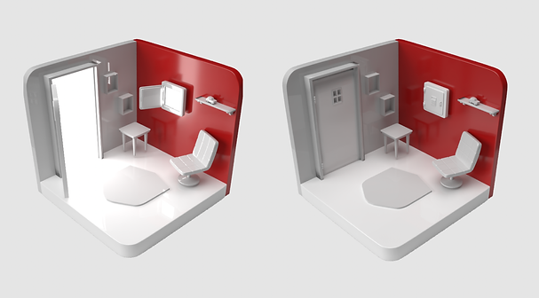
The user spaces are true 3D and live. Here the door and safe are open to show that the user's security is not set.
After completing some tasks via UI prompts, the door and safe would close, indicating that they are now in a secure space.
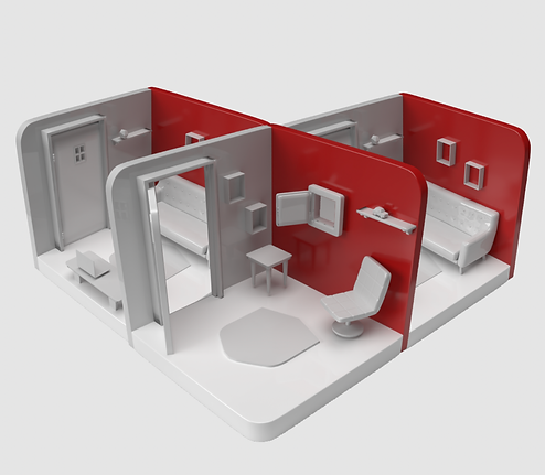
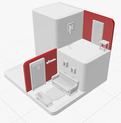
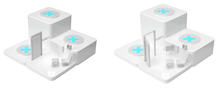
The user spaces can tile horizontally, as the user expands their protection across their devices. The space can also expand vertically as more and more spaces are added to represent individual protection, community and region.
Further simplified the user spaces into their most easily recognizable core elements. This allows the space interactions and visuals to work with the additional modal UI elements that would appear on the screen. Here we started incorporating the 3D elemnts into a mobile Dashboard exerience for McAfee users.
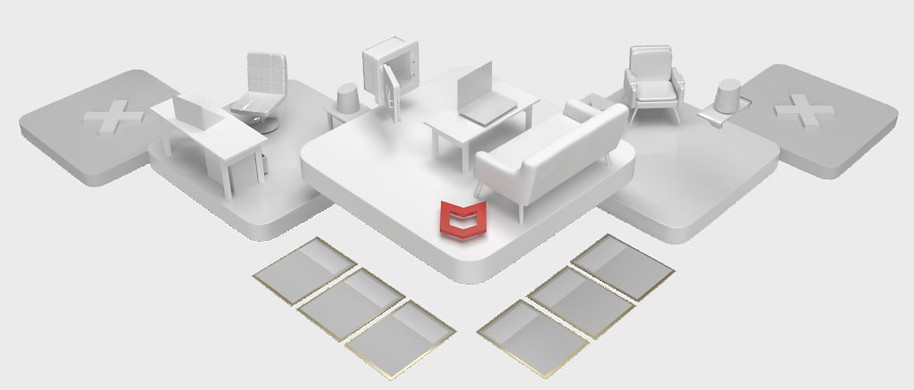
3D space layout for web browser|desktop with cards
I further simplified the room aesthetically. I also started bringing in notification icons/coins that would alert the user to actions that needed to be taken for their account. Here an open safe with the ID theft icon alerts the user to a potential security breach.
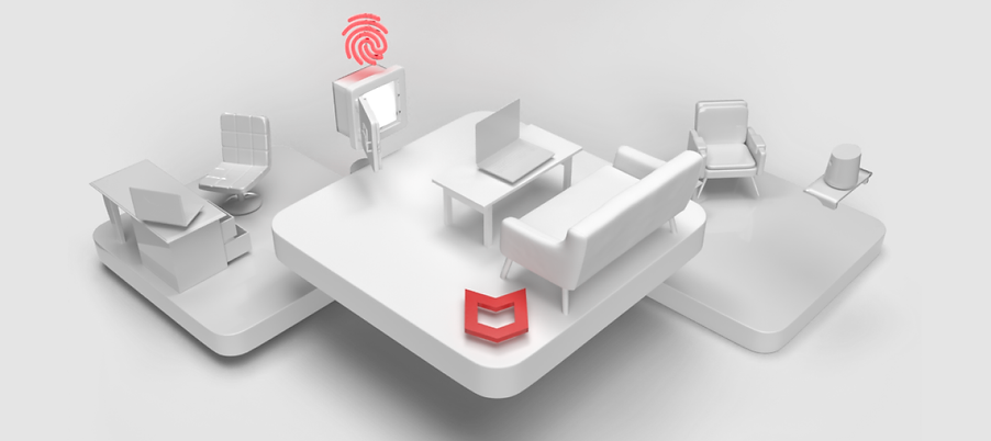
3D space layout for web browser|desktop.
Further explorations on how the spaces will morph and animate with interactions are under exploration. Here are a couple of sequences of the user selecting the home/account icon - and then transitioning to the home tiles that represent the different core account experiences.

Ideations on zooming in on the 3D space.
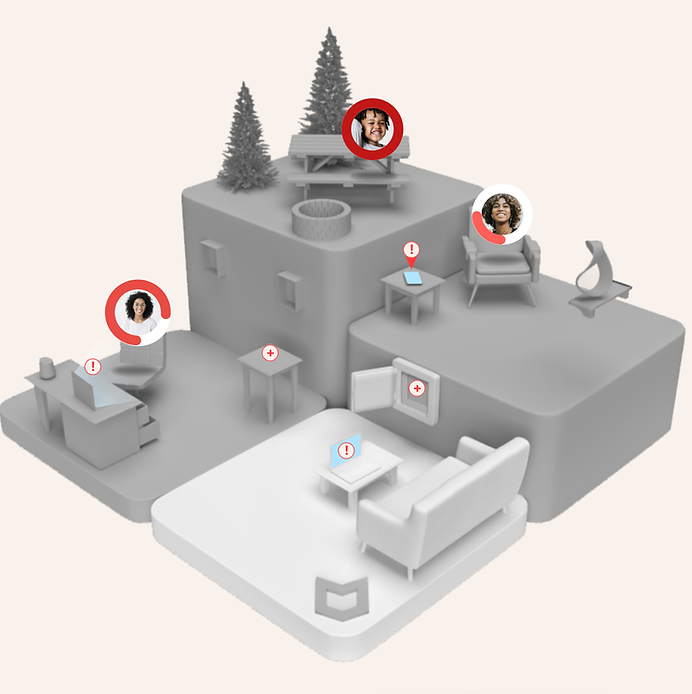
Multilevel spaces with notification layer.