top of page
Anchor 1
McAfee Shopping Cart
Rework of McAfee Shopping experience
Responsibility: Research, IA flows, UX Diagrams, Final visual design
Role: UX Lead, UI Design
Process: Research, Sketch, Iterate Solutions, Hand off to UX team, User Testing, Implement HW
McAfee's current shopping cart locks users into a single experience from product selection to payment. We needed a way to allow customers to add new products to the cart, as well as get them to log into their account.
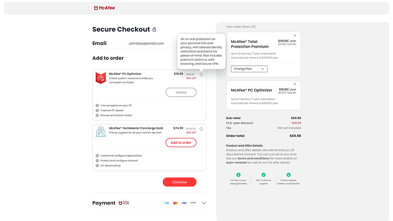
A "Candy Rack" layout was selected to able users to have several opportunities to add additional products to the cart. This also enabled McAfee to be able to add additional products, such as subscriptions, add-on products for family members, and reduce user friction in the purchase process.
There were a number of problems with the current McAfee cart that needed to be addressed.
1) The McAfee shopping experiences a linear track. A customer cannot go back
2) The McAfee shopping experience did not allow for multiple items to be purchased.
3) Customers did not need to log in or create an account for the purchase.
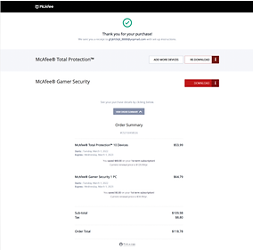
4) Customers were confused with steps required after purchase.
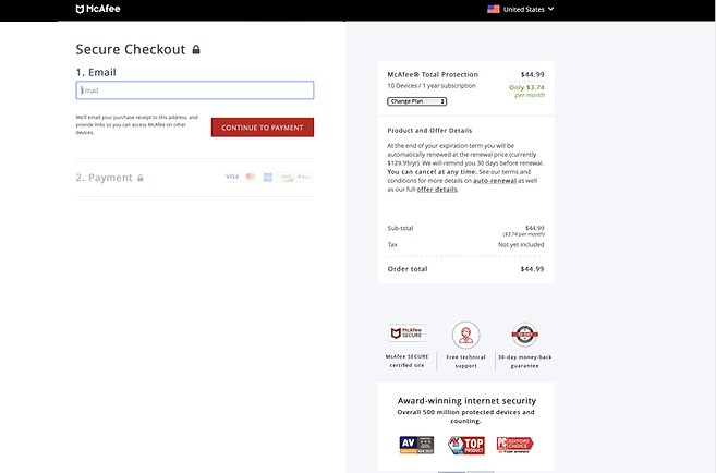
McAfee's current shopping cart locks users into a single experience from product selection to payment. We needed a way to allow customers to add new products to the cart, as well as get them to log into their account.
Rework of McAfee Shopping experience
Role: UX Lead, UI Design
Responsibility: Research, IA flows, UX Diagrams, Final visual design
Process: Research, Sketch, Iterate Solutions, Hand off to UX team, User Testing, Implement HW
McAfee's current shopping cart locks users into a single experience from product selection to payment. We needed a way to allow customers to add new products to the cart, as well as get them to log into their account.
A "Candy Rack" layout was selected to able users to have several opportunities to add additional products to the cart. This also enabled McAfee to be able to add additional products, such as subscriptions, add-on products for family members, and reduce user friction in the purchase process.
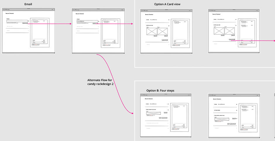
Once the overall UX flow was approved by the UX director and vetted with development, new High Res screens were created in Figma.

The design of the cart was created with new branding colors and button visuals. The UX and new visuals were then presented to company Executives for final sign off. final Figma files were then handed off for redlines and building in html.

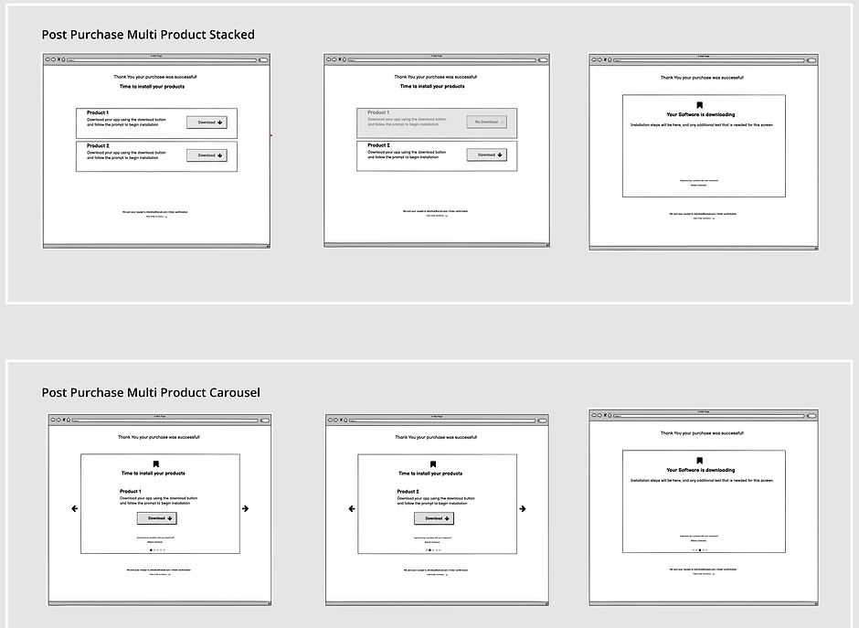
The second part of the project is new onboarding and installation.
After Purchase Before
After Purchase V1

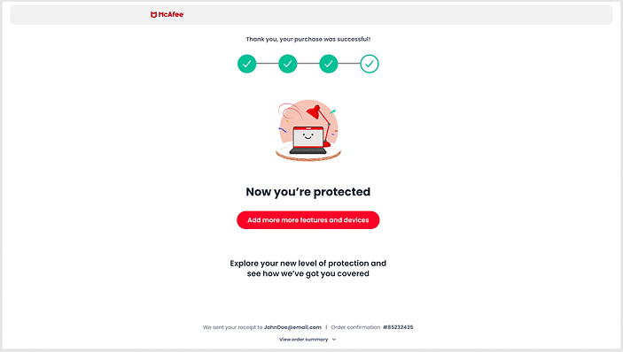
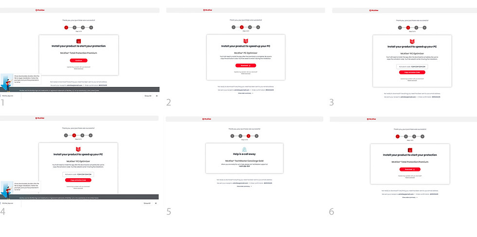
After implementing the new shopping cart and onboarding experiences, we showed a good increase in shopping cart conversions, up over 80%. But we were still having customer friction with the onboarding and software installation success after customer purchase.
To help pinpoint the onboarding issues, I created competitive analysis graphics to help jump start the process with our design team. These images showed how other companies focused their onboarding pages and provided a good comparison to our experience.
Discovery, a new path to the problem.


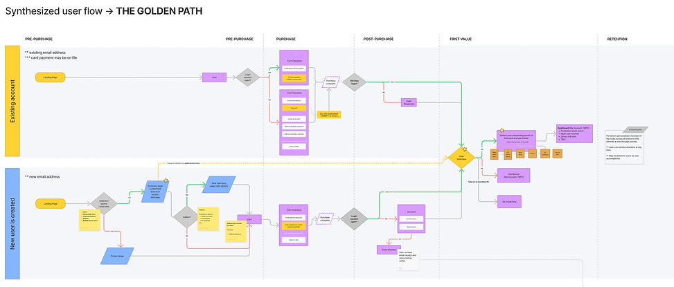
After presenting the competitor experiences, I helped lead several Fig Jam sessions with stake holders. The end result was the Golden Path IA flow. The golden path represented the ideal non friction pathway of the customer experience, and also highlighted the different side paths that could create friction for the customer.
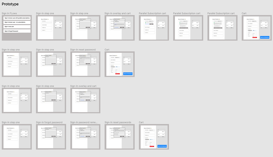
We were able to now see several verticals of the user experience that were handled by different orgs, and were causing some issues. One problem was account sign in. In order to illustrate the user friction with in these areas, I created numerous UX flows and prototypes so that the stakeholders could click through and experience the issues themselves (we also had user data to back up our flow.)
Problem (1) Log in was confusing.
One of the main issues we had was customer log in. Because we were not having customers log into their account before the shopping or purchasing, we had to handle account conflicts and creation in the shopping cart. This was casting immense friction and confusion. I prototyped not only the current experiences, but all the variable experiences that could occur. This enabled me to show the main friction areas and help convince the leadership team that we needed to have account sign in occur before the purchase process. Otherwise we were disrupting the customers purchase process by forcing them to deal with account options in the shopping cart - and not their account dashboard.
Problem (2) Onboarding and Dashboard
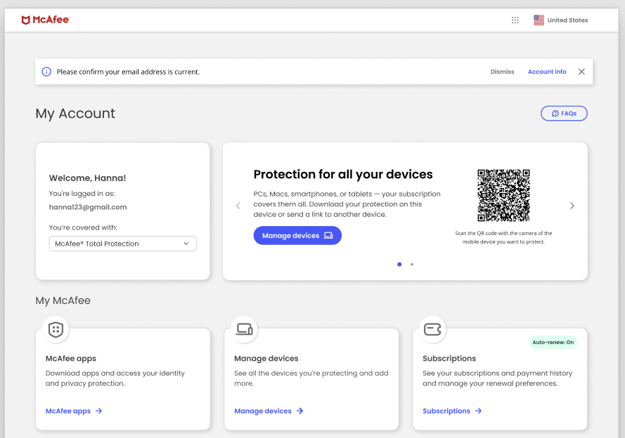
Customers were finding it difficult to find their newly purchased product in their dashboards, and were confused on how to start the onboarding process. There was not a clear way to see what they needed to do.
New feature - Dashboard Carousel
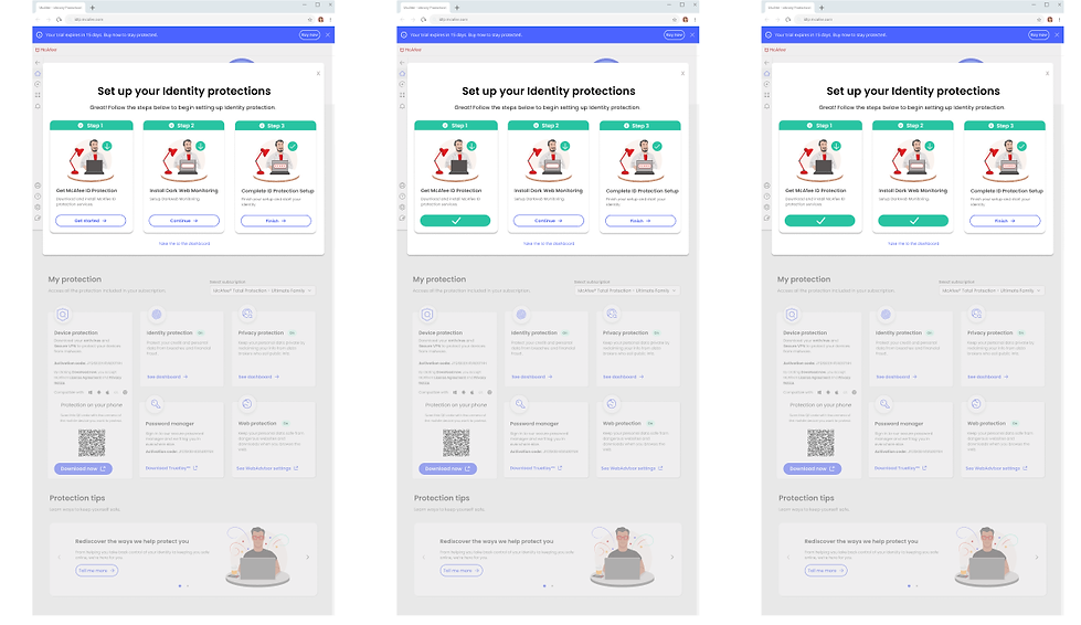
I helped create a new dashboard design with a functional carousel or action cards that would instruct the customer on the next steps needed for their onboarding process. Onboarding was narrowed to 3 steps. Each step would be shown via the cards, which would also show the progression of their onboarding
.png)
New feature - Security Score
I also created an interactive security score that would show customers the level of security they currently had active. The score would change depending on which features were purchased to activated after onboarding. The Score also acted as a quick navigation feature to deep dive into the customers security preferences.
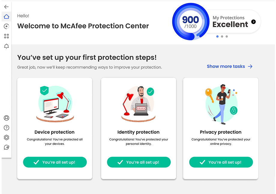
The new dashboard design with the carousel and security score provided customers with a clearly defined hierarchy, and helped guide them on the needed steps to enable their protection packages. The security score provided glanceable status on their current security level and if there were concerns on their protection status.
.png)
I also created a new loading animation that appears between experiences. The animation is meant to reinforce the new carousel/card interactions.
Onboarding to Dashboard, Dashboard to Protection Score, Dashboard to Social Privacy
Results
The Candy Rack design was tested successfully and is currently being implemented into the Mcafee purchase flow. The projected revenue increases are expected to have a huge impact for the 3rd and 4th quarters of 2022.
Additionally, this project kickstarted a new sprint into product onboarding and dashboard design
Reaction
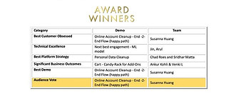
The design won an internal award at McAfee for the most business impact of new software features.
bottom of page